1
Clarity over decoration
The interface should help the work and thinking remain the focus. Typography, spacing and hierarchy do more of the work than decorative UI.
Case study
Portfolio Redesign
Additional information
A closer look at the visual foundations, reusable patterns and interaction principles behind the portfolio - designed to keep the experience consistent while allowing it to evolve.
Principles
The portfolio needs to support very different kinds of content - short positioning statements, project browsing, long-form case studies, images and deeper supporting pages. The design system provides enough structure to keep those experiences connected without making every page look identical.
The interface should help the work and thinking remain the focus. Typography, spacing and hierarchy do more of the work than decorative UI.
The visual language combines the structure of a digital product with the warmth and rhythm of editorial design.
Shared foundations and reusable components create consistency, while flexible content structures allow different project stories to be told appropriately.
Warm colours, restrained illustrations, conversational language and generous whitespace keep the portfolio professional without making it feel impersonal.
Foundations
The visual system begins with a small set of foundations that are reused across pages and components.
Typography
Source Serif 4 gives narrative content an editorial, human quality. IBM Plex Sans provides clarity for functional content, including body copy, navigation, labels, metadata, buttons and controls.
Display / Hero
Source Serif 4 / 3rem / 400 / 1.05
Product designer
Section heading
Source Serif 4 / 2.75rem / 400 / 1.05
A system built for clarity.
Subheading
Source Serif 4 / 1.5rem / 400 / 1.2
Small patterns, used consistently.
Body
IBM Plex Sans / 1rem / 400 / 1.65
Clear body copy supports longer stories and practical interface content.
Eyebrow
IBM Plex Sans / 0.875rem / 600 / 1.5
Design principles
Colour
Colour is used sparingly to establish hierarchy, warmth and interaction feedback. It is not the only method used to communicate state or meaning.
Background
--portfolio-background
#F7F2EA / Page background
Surface
--portfolio-surface
#FFFCF7 / Cards and raised surfaces
Warm surface
--portfolio-surface-warm
#DDD5C9 / Soft backgrounds and chips
Primary
--portfolio-primary
#234437 / Headings, navigation and primary UI
Primary hover
--portfolio-primary-hover
#18382E / Interactive primary hover state
Accent
--portfolio-accent
#C56E4A / Display emphasis, decoration and active details
Accent text
--portfolio-accent-text
#91462D / Accessible small text and CTA backgrounds
Text
--portfolio-text
#1F2A25 / Default text
Muted text
--portfolio-text-muted
#555D57 / Supporting copy and metadata
Border
--portfolio-border
#DDD5C9 / Dividers and quiet boundaries
Accent subtle
--portfolio-accent-subtle
#F3E2D8 / Decision emphasis
Spacing
Spacing contributes to the editorial rhythm of the portfolio. The implementation uses explicit page, block, grid and section variables alongside component-level conventions.
Page gutter
1.25rem → 2rem → 3rem
Block space
2rem → 3rem
Grid gap
1.5rem → 2rem
Section space
7rem globally / 4rem in case studies
Layout
The main content container is capped at 72rem with a 42rem reading measure. Page gutters expand at larger breakpoints, while grids and the case-study sidebar adapt at desktop widths.
The explicit token breakpoints are 48rem and 80rem. Components also use the existing Tailwind sm, md and lg breakpoints for responsive composition.
UI Elements
Buttons and links
Tags and breadcrumb
Components
The examples below render production components with real portfolio data rather than recreating their markup for documentation.
I ask the right questions, challenge assumptions and get to the root of user and business needs.
I bring people together, translate complexity and align around what matters most.
I design intuitive solutions and document decisions so teams can move forward with confidence.
Process steps
I explore the problem space, understand users, context and business goals.
I synthesise insights to frame the right problem and define clear opportunities.
I generate ideas, explore options and co-create with the team.
Iconography
Icons use supplied thin-outline SVG assets, recoloured through currentColor by the shared OutlineIcon component. They support comprehension and metadata rather than becoming decorative focal points.
Illustration
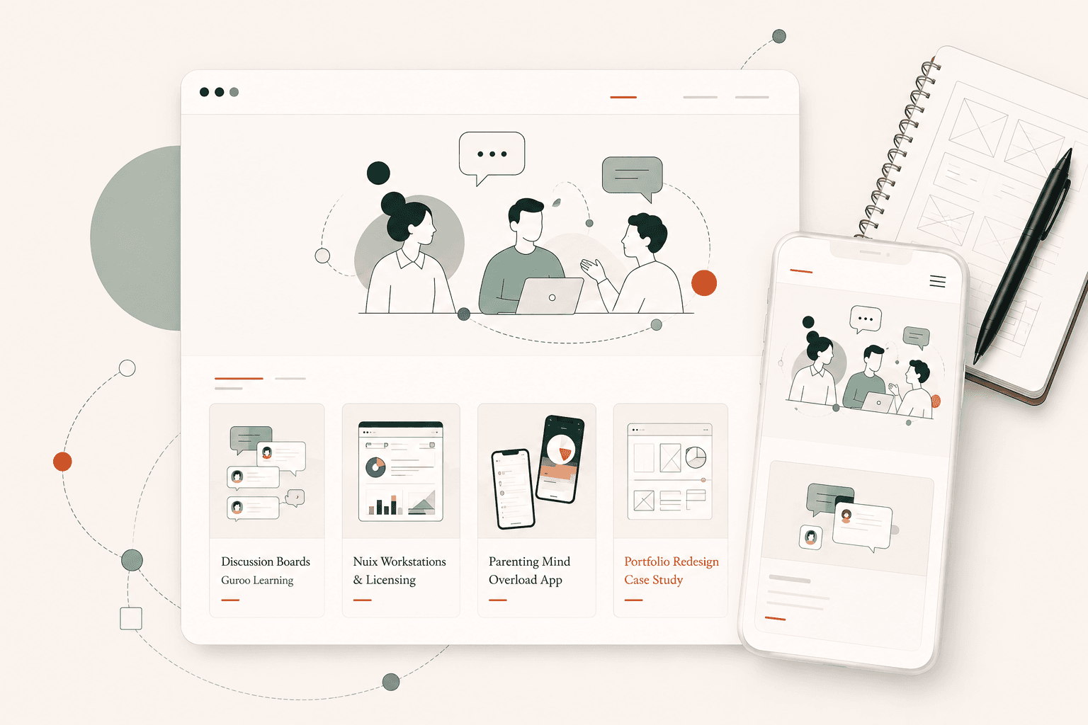
Existing illustrations use simple outlines, abstract people, small areas of green and terracotta, soft neutral shapes and restrained compositions. They support meaning rather than decoration.


Illustration prompt
To keep new illustrations visually consistent, I use a shared set of constraints covering line treatment, colour, abstraction, composition and the way people are represented.
The subject can change, but the visual language stays consistent.
Create a minimal editorial line illustration for a Product Designer portfolio.

VISUAL LANGUAGE

Match this established illustration system:

- Clean, refined thin-outline illustration
- Elegant editorial feel rather than cartoon, corporate vector art or playful SaaS illustration
- Simple geometric construction
- Minimal visual detail
- Plenty of negative space
- Calm, balanced composition
- Human and approachable, but sophisticated and professional
- Abstract rather than highly realistic
- Objects and people should be simplified to their essential forms
- People, when present, should have minimal or no facial features
- Avoid detailed faces, realistic anatomy or character-like expressions
- Avoid unnecessary decorative elements

LINE STYLE

- Fine, consistent dark-green/charcoal outlines
- Mostly uniform stroke weight
- Smooth, precise curves
- No sketchy lines
- No heavy outlines
- No black-filled shapes
- No drop shadows
- No blurry shadows
- No gradients unless extremely subtle and specifically requested
- No 3D effects

COLOUR

Use colour sparingly.

Primary palette:
- Deep forest green
- Muted sage green
- Warm terracotta
- Warm cream / stone neutrals

Most of the illustration should remain unfilled or neutral.

Use small areas of green and terracotta as visual accents rather than filling the entire illustration with colour.

Soft abstract background shapes may use pale sage, warm cream or stone at low visual intensity.

COMPOSITION

Keep the illustration simple and spacious.

Use:
- thin connecting paths;
- small circles/dots;
- subtle organic geometric shapes;
- simple speech bubbles;
- simplified interface/window shapes;
- abstract diagrams;
- restrained visual metaphors.

These elements should create a sense of:
- connection;
- collaboration;
- clarity;
- product thinking;
- ideas becoming structured;
- people working together.

Do not try to fill all available space.

Negative space is an intentional part of the illustration style.

PEOPLE

When people are included:
- use simplified outline figures;
- minimal facial detail;
- simplified hair and clothing;
- natural but abstract poses;
- diverse, neutral representation;
- people should support the concept rather than become the focal point.

Do not default to a male central character.

If depicting a Product Designer as the main individual, use a woman unless instructed otherwise.

STYLE TO AVOID

Do NOT use:
- cartoon illustration
- childish characters
- exaggerated proportions
- detailed facial features
- photorealism
- isometric illustration
- glossy 3D
- corporate stock illustration
- overly colourful SaaS artwork
- gradients
- dramatic lighting
- heavy shadows
- busy backgrounds
- excessive icons
- excessive decorative shapes
- text inside the illustration unless explicitly requested

The result should feel like a sophisticated editorial illustration created specifically for the same portfolio design system.

CONTENT FOR THIS ILLUSTRATION:

[DESCRIBE WHAT THE ILLUSTRATION SHOULD COMMUNICATE HERE]

OUTPUT:

- Transparent background
- PNG
- High resolution
- Clean edges
- No surrounding canvas colour
- No text unless explicitly requested
- Composition should work naturally within a responsive website layout
Reference image
For stronger consistency, I pair the prompt with an existing portfolio illustration and use it as the visual-style reference.
“Use the attached illustration as the visual-style reference. Match its line weight, level of abstraction, colour restraint, proportions, use of negative space and overall editorial character. Do not copy its composition or subject matter.”
Responsive Design
Responsive design is treated as a change in context rather than simply a smaller canvas. Components preserve their purpose across breakpoints, but their layout or interaction can change when the desktop pattern no longer makes sense.
Desktop uses a sticky left navigation. Smaller screens use a compact current-section select.
Desktop uses a compact horizontal preview and full-screen viewer. Mobile uses smaller touch-friendly controls and a scrollable thumbnail strip.
Columns reflow into a logical reading order instead of forcing horizontal scrolling.
Accessibility
Semantic landmarks, headings, keyboard-accessible links and controls, visible focus styles, meaningful image alt text, native disclosure controls and dialog labels.
WCAG 2.2 AA, sufficient contrast, reduced-motion support across motion patterns, complete focus management for dialogs and no reliance on color alone.
Accessibility is checked as patterns evolve, with content, interaction and responsive behaviour reviewed together rather than treated as a final pass.
Motion & Interaction
Existing motion is restrained: hover transitions provide feedback, gallery controls support orientation and navigation changes are subtle. Reduced-motion handling is applied where scripted scrolling is used; broader motion coverage remains a system target rather than a fully centralised utility.
Content
The portfolio's consistency also comes from the way content is structured. Projects, case-study sections, media and related pages are represented as data rather than being hard-coded into individual page layouts. This allows the same components to support different stories while keeping navigation, presentation and responsive behaviour consistent.
Scalability
The goal was not to create a frozen set of screens. The system supports new projects, different case-study narratives and deeper supporting content without requiring the portfolio to be redesigned each time.
Reflection
Building the design system alongside the portfolio helped turn subjective visual choices into reusable decisions. It also made inconsistencies easier to spot. The system is intentionally small: its purpose is not to document every possible variation, but to provide enough shared structure for the portfolio to remain coherent as it grows.